For human resource agencies and community action agencies
Your agency's data, in one dashboard.
One dashboard for the whole agency — the ledger, every department, every county, every month — built from the files your offices already make. An AI assistant sits on every page.
Explore the live demo → How it works
- Finance
- Transportation 5311
- Community services CSBG · LIHEAP
- Every county
- Ask anything
What it is
Business intelligence, custom tailored to your agency.
Custom business intelligence used to be out of reach for a small agency — a consultant, a long build, and a system nobody could maintain once they left. Those days are gone. Flagstop is built on your priorities, your KPIs and your goals: configured to your agency, not templated, and updated automatically as those offices file.
Your priorities
We start with what you want on the dashboard and build the pages around it — the questions your board, your funders and your directors actually ask.
Your KPIs
Your definitions, applied everywhere: what counts as on-time, when a no-show counts, how the ledger groups into programs. Mapped once, printed on the page.
Your goals
Leadership sets the targets; every home shows progress against them, month by month. The dashboard never invents a goal.
The assistant
An AI assistant on every page, held to the page.
Every figure on the dashboard carries a ✦. Press it and the assistant explains that number in plain English — what it is, what moved it, what to watch — using only the figures the page itself shows.
About this figure — Cost per trip · $28.44 · ▼ 2.0% vs FY25 — what is it, what moved it, and what should I watch?
Cost per trip is $28.44 for FY26, down 2.0% from FY25. Operating expense rose 4.8%, but trips rose 7.0%, so each trip cost a little less.
Intercity is the costliest service at $53.03 a trip; fixed route the least at $7.69. The biggest move this year is fixed route, down 5.6% per trip.
7 figures checked against the page · nothing unverified
How it's held honest
- It only sees the page's figures. The same aggregates you see — counts and dollars by program, county and month. Never a client or rider record.
- Every number is checked before you see it. Each figure in an answer is matched against the page's own data. Anything it can't verify is marked, so nothing gets quoted by accident.
- It doesn't guess at causes. It says what moved and by how much. A cause is offered only as a question for a person to answer.
- It's set up once, for the whole agency. Every login gets it. Nothing to install, no keys to manage.
Where you'll see it
✦ on every number
One press opens the question — what is it, what moved it, what should I watch — and a plain-English answer.
Ask the dashboard
A question box on every page that can reach the whole dashboard: which county moved most, where cost per trip rose, what the ledger says about fuel.
The month in words
When a month’s files load, the assistant drafts the month, quarter and year in words. It’s published only when every figure verifies, and re-checked every time it’s read.
Findings after every upload
Proposed insights, filtered by rule — no unverified figures, no causes stated as facts — and a person decides which ones stay.
Why it holds up
Every number, traceable.
Traced to the source
Hover over a figure and it says where it was read from — the workbook, the tab, the cell.
Same months, every comparison
A young year is compared with the same months of last year, never quietly with a full one.
The count behind every rate
The page says whether 71% is 5 of 7 or 1,100 of 1,550.
Aggregates only
Counts and dollars by program, county and month. No rider or client records in the cloud.
See it for yourself.
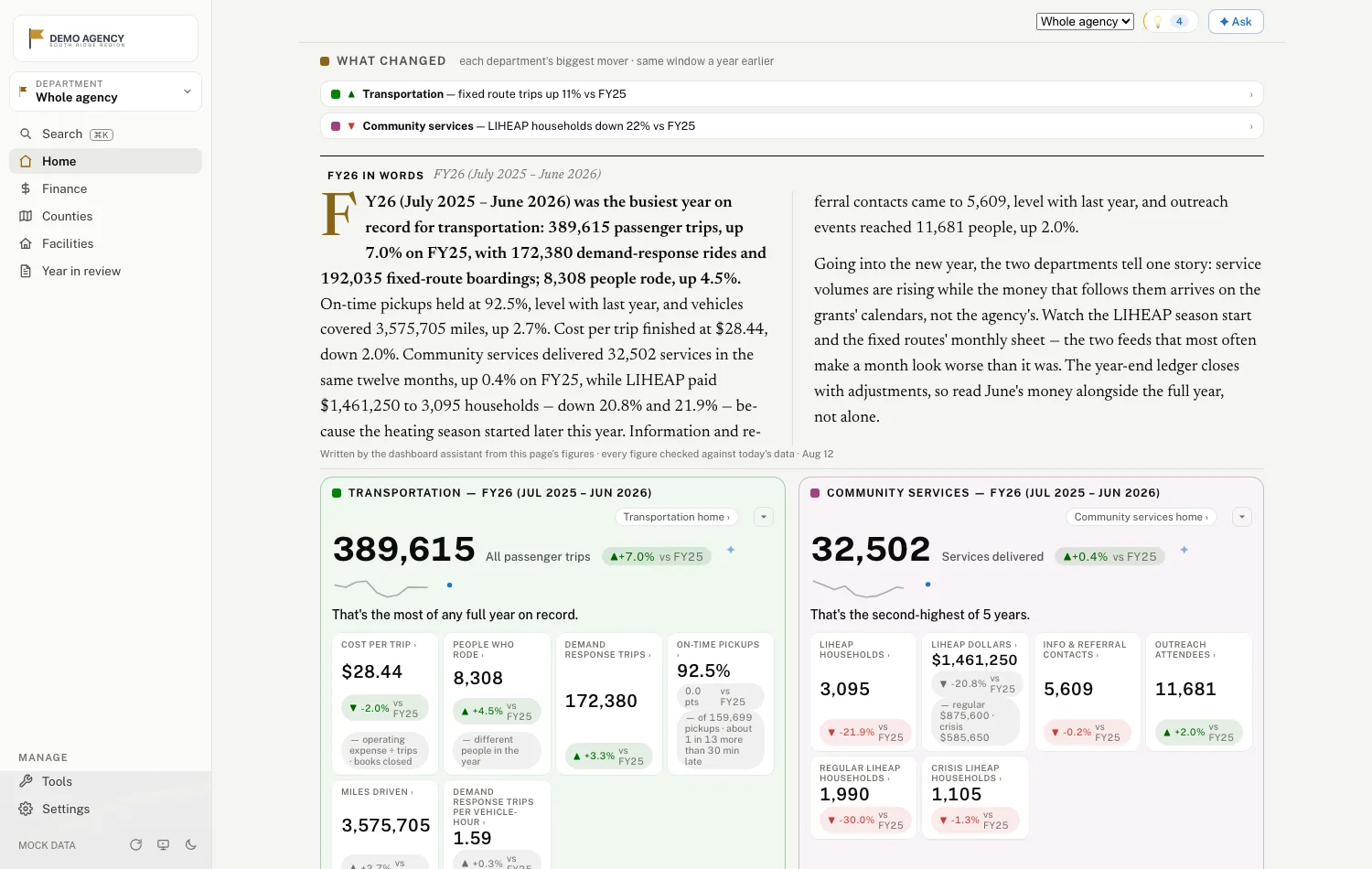
A fictional agency, synthetic data, no login, nothing to install. Land on the agency, open finance, pick a department, drill to a county, press a ✦.
The agency home A county sheet The ledger Cost containment Transportation Cost per trip, with its ✦ The state monthly report
↗ Opens in a new tab — this page stays open behind it.

Why "Flagstop"
A flag stop is a rural transit tradition: no shelter, no sign, no schedule board. You stand where the driver can see you, and the ride stops where you are. Flagstop meets your agency where it is — whatever system you run, whatever shape your workbooks are in.
Say hello
Saw the dashboard somewhere and want to know what it would take to onboard your agency? Write us, and we'll talk it through. We'd love to talk.